Designed For People Who Aren’t Looking
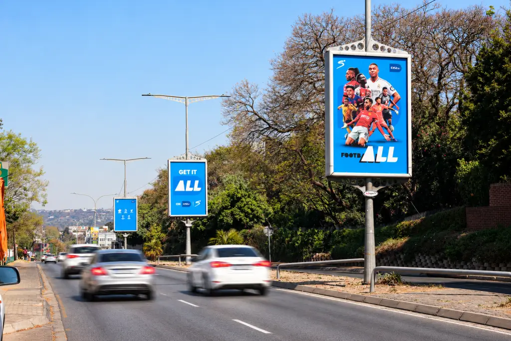
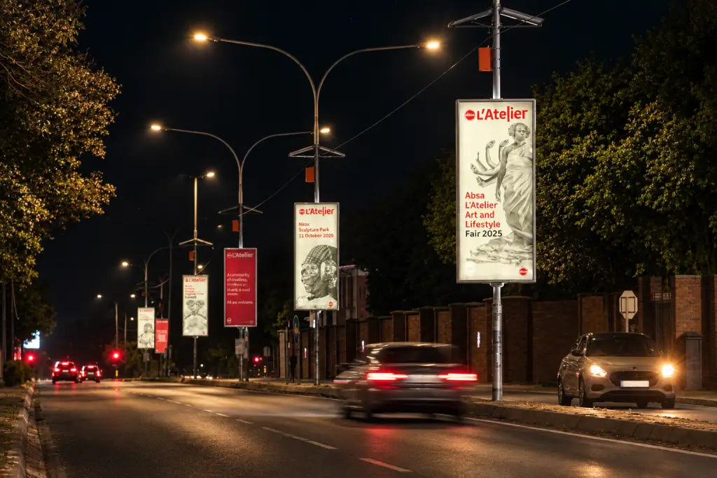
A driver passing a street pole ad gives it a glance, not a read. They’re watching the robot, the taxi cutting in and the pothole ahead, so your board has to land its message in that glance, from across the road.
That’s why artwork that works in a magazine or on Instagram often fails on a pole. Small type, busy photos and long copy all vanish at distance.
We’ve been putting up street pole ads since 1998, and the boards that work tend to follow the same few rules. Here they are, with the print specs your designer will need at the end.
Rule 1: Eight Words, No More
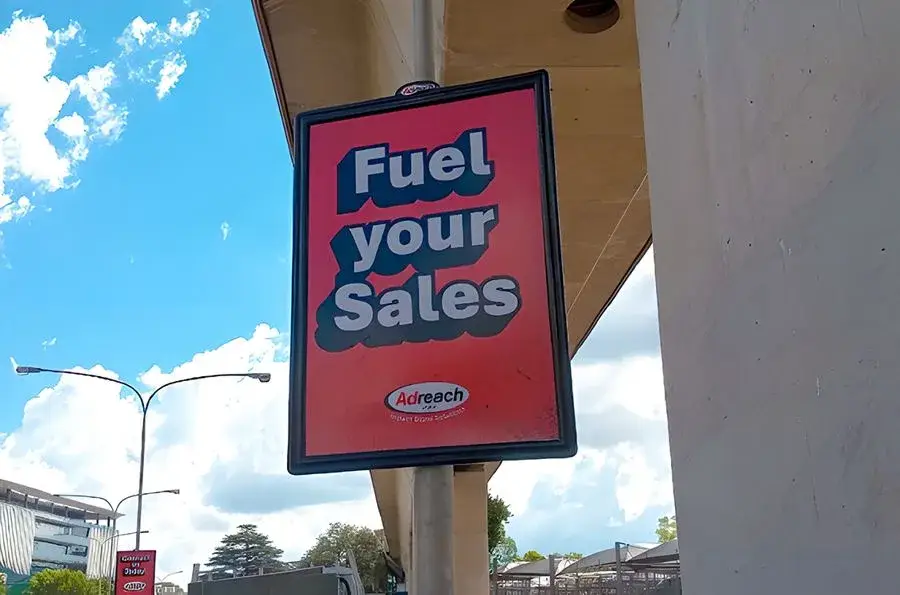
Keep each board to eight words or fewer. It’s a council requirement, and it’s also simply good design: every extra word makes the others smaller and slower to read.
Text must also be at least 60 mm high. Think newspaper headline, one idea said plainly. If you can’t get the message into eight words, it probably isn’t clear enough yet.
Drop the full stops while you’re at it. They slow the eye down and add nothing on a board.
Rule 2: Use All Three Boards
Street pole ads go up in runs of three, so a driver sees them one after the other. Printing the same busy board three times wastes two of them.
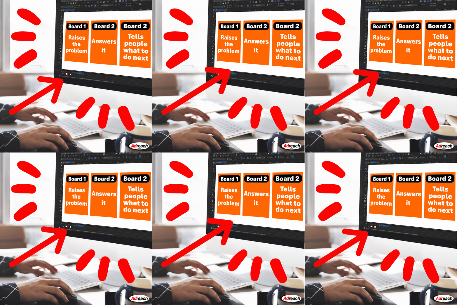
Treat the run as a sequence instead. Board one hooks or raises a problem, board two gives the answer or what makes you different, and board three tells people what to do next.
Three boards also help you avoid ad fatigue. Board one raises the problem, board two answers it, board three tells people where to go. Your audience sees your brand three times without reading the same line three times.
Keep the background colour the same across all three so they read as one ad.
One exception: Pretoria’s council doesn’t allow storyboards. If your campaign runs there, every board has to make sense on its own and carry your logo.
Rule 3: Make It Readable From Across The Road
Contrast does most of the work. Lettering should stand out sharply from the background, dark on light or light on dark, never mid-tone on mid-tone.
Choose bold, thick fonts and give them room. Letters that touch, thin strokes and decorative scripts all blur at distance.
Keep the background simple. Detailed photos and dark shaded backgrounds turn to mush from the street, and text laid over an image is often unreadable. For an illuminated Supalite, a darker background with lighter text usually works best.
Rule 4: One Call To Action, And Make It A Website
Give people one thing to do. Nobody behind the wheel is going to write down a phone number, but a short web address is easy to remember.
Put the URL on the last board and make it big. Don’t stack a phone number, an email address and a row of social handles underneath it, because each one shrinks the thing you actually want people to see.
Rule 5: Respect The Safe Area And The Rules Of The Road
Every format has three sizes: the print size, the visible area and the safe area. The frame hides the outer edge of the print, so keep all text and logos inside the safe area or risk losing them.
Put your logo on every board. Pretoria’s council requires it, and it’s worth doing everywhere because you can’t predict which board someone remembers.
Two things are off limits. Nothing on the board may look like a traffic sign, and in Pretoria arrows aren’t allowed either, so use a hand sign if you need to point.
Artwork Sizes For Our Main Formats
All sizes are height × width in millimetres, portrait.
| Format | Print size (mm) | Visible area (mm) | Safe area (mm) |
|---|---|---|---|
| A0 | 1210 × 865 | 1179 × 831 | 1119 × 771 |
| 1.8 | 1700 × 1205 | 1605 × 1110 | 1575 × 1080 |
| Icon | 3030 × 1200 | 2930 × 1100 | 2900 × 1070 |
Some regions, including East London, George, Potchefstroom and Richards Bay, use different sizes, so check with your Adreach rep before you start.
How To Supply Your Artwork
A good design can still print badly if the file isn’t set up properly. Here’s what we need and why.
Send A Print-Ready PDF
Supply a high-resolution PDF at the full print size for your format, with no crop or colour marks. Convert all text to outlines (also called paths) so the printer doesn’t need your fonts and nothing gets swapped for a default typeface. Embed images in the file instead of linking to them.
If the full size is too big for your design software, set the artwork up at 50% scale and keep the proportions exact. Tell us it’s at half size when you send it.
CMYK, Not RGB
RGB is how screens make colour, by mixing red, green and blue light. CMYK is how printers make it, by layering cyan, magenta, yellow and black (the K) ink. Light can produce brighter colours than ink, so some RGB colours have no exact CMYK match.
That’s why a neon green or electric blue that looks great on your monitor can come out duller on the pole. Set your document up in CMYK from the start, or convert it before you finalise and check that the colours still look right. If a brand colour has to be exact, send us its CMYK or Pantone reference.
Resolution (DPI)
DPI, or dots per inch, is how much image detail sits in each inch of the print. A low-resolution photo looks blocky or blurry once it’s blown up to pole size.
Street pole ads are seen from a distance, so photos don’t need the 300 dpi you’d use for a brochure at full size. As a rule of thumb, aim for around 150 dpi at full print size, which works out to 300 dpi if you’re working at 50% scale. Your Adreach rep can confirm the right figure for your job.
Text, logos and shapes built as vector artwork aren’t affected by dpi at all, so keep them as vectors wherever you can. And never stretch a small web image to fit. Raising the dpi setting afterwards doesn’t add detail that was never there.
Before You Send It To Print
Run through this list before the artwork leaves your desk:
- Eight words or fewer on each board, with text at least 60 mm high
- Strong contrast between lettering and background
- The same background colour across the run of three
- One call to action, with the web address easy to spot
- Your logo on every board, and everything inside the safe area
- No arrows or anything that looks like a traffic sign
- A CMYK PDF at full print size, text outlined, no crop marks
Then do the A4 test. Print the board on an A4 page, take eight steps back and see what you can still read. If you’re squinting, so will the driver.
Planning a run? Get in touch with Adreach and we’ll help you get the artwork right for your sites.